Saturday, December 10, 2011

Photo Comparison - iPhone and a "Real Camera"


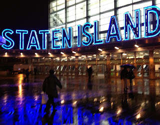
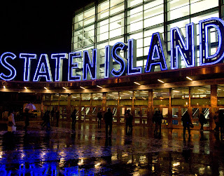
Staten Island, originally uploaded by Cocoabiscuit.

These two shots of the Staten Island Ferry terminal were taken within minutes of each other, the first with an iPhone 4S camera that automatically calculated the settings, the second with a considerably more expensive Nikon D300 with the exposures chosen based on metering and experience. Which one do you like better?
What are the differences?
1) Settings: iPhone shot is f 2.4, 1/20 sec, ISO 250 and the Nikon is f 3.5, 1/200 sec, ISO 3200.
Just as a brief review, the f stop is how large the opening of the shutter is (and therefore how much light is allowed in), similarly the lower the denominator of the shutter speed the longer and therefore more light is let in, and the ISO is how sensitive the sensor in the camera is to light, the higher the number the more sensitive (and therefore more light). So, the darker the scene is the lower your aperture, the lower your shutter speed denominator, and the higher your ISO. That all sounds great, except by pushing each of these to maximize light entry you lose in f stop by decreasing the delpth of how much of the image is in focus, you blur motion, and you add noise (speckles) to shots.
The new iPhone 4S is much better from the previous version for low light because the sensor has been made more efficient in capturing light without adding significant noise and the aperture is larger (1 f stop) without losing sharpness. There's a nice review of the iPhone 4S from a photographer's perspective with more details on this at Time Techland and another one with even more technical detail here at ars technica.
In these two shots, the iPhone version is fuzzier, but most of this softness comes from the 1/20 sec exposure compared to 1/200 sec from the Nikon-- a much longer time of shutter opening required to get the same amount of light.
2) Lenses: The iPhone lens has remarkably good resolution given its small size (1/2 inch diameter and made of polymers) compared to the Nikon's about 2 1/2 inch version that is actually a series of glass lenses and prisms working in concert with each other.-- more here on that. The better Nikon lens also contributes to the better sharpness of the image.
3) White balance: If you remember from high school physics, white light is actually a combination of all of the other colors in the spectrum, so white is rarely purely white and light hitting an object is also rarely pure white-- light on a sunny vs. cloudy day, tungsten light bulbs vs. fluorescent light bulbs will be different. You can manually set white balance on the more expensive cameras or let the camera calculate it. Generally the less expensive the camera, the less customizable and the less good the camera is at figuring it out. The 4S has improved white balance calculation algorithms. You can see in these shots, that the iPhone found the lighting to be more blue than the Nikon did (and my remembrance is that the Nikon color is more true to what my eyes saw) but they are pretty close. Last summer, I goofed when I took this shot, Kitty Jan, by mistakenly setting the white balance to fluorescent instead of daylight, but it worked out-- the camera added in purples to the already purplish sunset because it thought it was compensating for fluorescent lighting that has very little purple light.

So, which shot do you like better? For this scene, I prefer the iPhone version. The Nikon version is technically better and more sharp, but for these rainy evening with diffuse light and people hurrying for the ferry, I like the little bit of fuzziness of it.

Tips to maximize your images in low lighting: 1) keep the camera as steady as possible-- propping it on something, steadying your arm on something, or using a tripod 2) shoot stationary objects (unless you want an artistic blur) and 3) maximize the available light by looking at light coming from buildings and light posts, incorporating that into how you compose your shot.

Wednesday, June 22, 2011

Shooting Water


When making decisions about photographing water, consider how you want the water to look. Both of these waterfalls were shot in Southern Iceland within an hour of each other in early evening, but have radically different looks. In the bottom one, "Horse Tail", the Seljalandsfoss (foss means falls), the water looks creamy/feathery because there is a long shutter speed (8 sec) allowing for a higher volume to pass by during the capture. In the top one, "Tumbling Waters", at UrriĆ°afoss, the water has spikes as if frozen in motion because of a fast shutter speed (1/125 sec) that stops motion. Both were shot with an aperture of f22 at ISO 200. If my math is right, 1000 times as much water flowed by at a given point in the second than in the first.
Both effects are nice, but give a different feeling. In the slow capture, it is closer to what the eye sees and is dreamier. In the top photo, you have much more of a sense of how frantic and hurried the water seems as it rushes over the rocks. Getting the fast capture is easy and is probably what you will get by putting the settings on automatic. The longer exposure requires more work. To lengthen the time the shutter is open (shutter speed), you will need to decrease the amount of light-- use a small aperture (f stop) and either shoot at near dusk or dawn or add a filter that decreases the light entry (or both). For this one, I shot in the early evening and used a 4x (reduces the light to 25%) neutral density (ND) filter, courtesy of Tony Prower at Iceland Aurora Photography.
If you want to go low tech and using your iPhone or a point and shoot, you can use sunglasses to cover your lens and it will help. Also, thanks to Tony who guided us to these beautiful waterfalls and gave me many useful photo tips.

Tuesday, April 5, 2011

Thank you Nilda and Carrie...


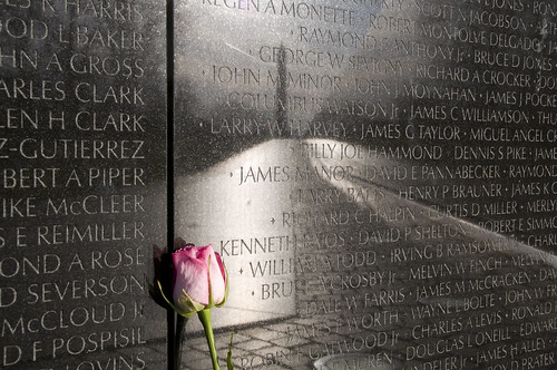
Ode to Lost Futures, originally uploaded by Cocoabiscuit.

At your suggestion, I entered this photo into The National Photography Competition and it is one of 50 finalists to be included in an exhibition at the von Liebig Art Center in Naples, Florida that will run from May through August. Stay tuned to see how I fare in the final round. Sadly, I won't be able to attend the opening reception in May to hear the announcement of the grand prize winner and a lecture by the judge, Harry Benson. I admire his photography.
This photo is one that I took on one of my recent trips to DC. It is of the a reflection of a path towards the Washington Monument, reflected in the wall of the Vietnam Veteran's Memorial. The wall is made from gabbro, a mineral chosen from its highly reflective quality. Enscribed on the wall are the 58,175 names of US forces killed or missing in action from the war.
I took the photo with my Nikon D300 (handheld because the park police frown on tripods on the mall) with a small aperture (f 16) to have a long depth of field to get as many names in focus as possible and a shutter speed of 1/125 (ISO 200). I got lucky with this shot and had to do very little processing in Photoshop.

Sunday, April 3, 2011

Getting the Most from Your iPhone (Part 4) - Turning Bad Light Into Interesting Light


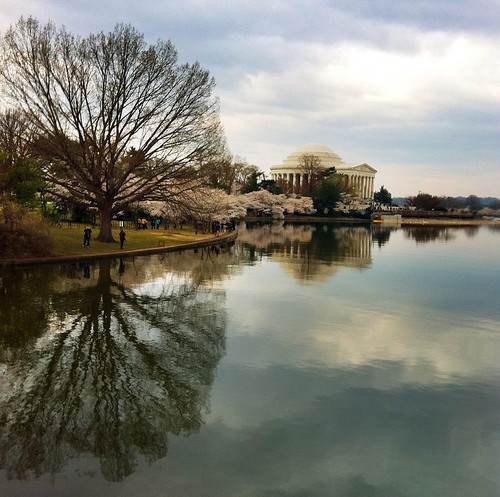
Interesting Light, originally uploaded by Cocoabiscuit.

At the most basic level, photography is about capturing light. Imagine that light is being painted onto objects and that you are capturing a moment in time-- the first light of sunrise onto the side of a building, light streaming through a window onto a floor, or a scene fully illuminated by the midday sun. Sometimes, it seems that the light is "bad", on a day where it's cloudy, rainy, etc. In this photo that I took when traveling to DC to photograph cherry blossoms in what I hoped to be scintillating spring sunshine, I instead found myself dodging raindrops and making the most of it with occasional sunbreaks. This photo, Interesting Light, of the Thomas Jefferson Memorial, shows how to maximize less than ideal light for interesting effects.
First: I used the ProHDR app (described in a previous posting) to make the most of the available light and even out the bright areas and the shadows.
Second: I maximized the use of reflection. By including the reflection in the Tidal Basin to essentially "double" the light. By having the bright patches of sky appear twice, it lightens the photo. Reflections in general add interest to photos.
Third: Include elements with high contrast, especially white objects, e.g. in this the dome of the monument and the cherry blossoms on the trees. These also serve to multiply light by having additional elements reflect light back to your eye.

Sunday, March 27, 2011

Getting the Most from Your iPhone Camera (Part 4) - PhotoPad, a Versatile App for Adding Effects


As you can see from these two photos, there's a wide range of things you can do with your photos once you've taken them. Both of these edits were made with the PhotoPad app. In the top photo, I wanted to make the regular photo of a scupture at Gettysburg National Park have a more vintage appearance. In the second, I wanted to add a caption to the photo of apples. In the first, I used the "chromaticity" tool under the buttom with the symbol showing sliders. In the second, I used the paintbrush tool under the button that looks like a suitcase. There's also options for cropping, rotating, and red eye reduction. The edits are a little tricky on the iPhone because of the smaller screen, but it works well on an iPad.

Friday, March 25, 2011

Getting the Most From Your iPhone Camera (Part 3) - A Fun App, Color Splash


Now you're getting the hang of what you can do with your camera, you have basic photos and you want to have a little fun. So, now I will give a series with a few apps towards that goal:
Today one of my favorites, it is Color Splash: This app allows you to have selective color on your shot, with the rest turned to black and white. The app starts by converting the entire picture to black and white and then you use your finger to paint back in areas of color. The photos above, Red Roses for You, are the pre- and post- using Color Splash. It works best with photos where you have a something in the photo with bright colors (like the roses and the cat's eyes) that accentuating would really add impact. There's a video review here that has a tutorial.
Feel free to download pictures from my Flickr to play with if you want to play with the app without having to take pictures. All you do is go to a photo, click on it, then use the + sign on the upper right hand corner to put it on the lightbox. Then click on the "view all sizes" button, again in the upper right hand corner and choose a size to download. The "medium500" is probably just about right to play with on an iPhone or iPad. My suggestions for ones to try are: Joy, Pas de Deux, S Curve, Water Play, and The Thinker.

Thursday, March 17, 2011

Getting the Most From Your iPhone Camera (Part 2)


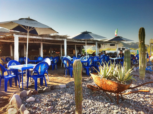
Restaurant Vista al Mar, originally uploaded by Cocoabiscuit.

Before shooting a lot of photos, you're going to need to outfit your phone with the right apps. Apps will help you take better pictures and allow you to edit them once you have them. My workflow is that I take the picture and if I need to do much editing or I want to take a closer look before uploading, I transfer it to my iPad and then edit and upload it from there. In this blog, I'll cover basic shooting and editing apps.
Apps to take a different kind of picture:
My favorite is Pro HDR. It's the app that I used to take the picture above. I have more on HDR in a past blog, but basically: most cameras cannot capture the full dynamic range that the human eye can see. Even with the best camera, there are areas that are too light and others too dark and you lose detail in those areas. In HDR, there are multiple images (usually at least 3) with underexposure to capture the dark areas (but losing the sky) and overexposure to capture the light areas (but the darker areas lose all detail. Software then smart averages the images to create the best. For this you could spend $100 for your desktop or $1.99 in the app store. Pro HDR requires holding the camera still while the camera analyzes and then takes two shots (one under and one overexposed) and then blends them. You can do final edits. It adds a cool look to a lot of different scenes but is essentially in those tricky lighting situations. Don't expect to get moving objects those because moving objects can take on a ghost like appearance (which in itself can be cool).
Apps for photo editing: I use Photogene or PS Express in my iPhone and Photo Pal or PS Express on my iPad. In these, you can crop out areas (remember that trash can from the previous blog?), adjust the lighting and other special effects like adding frames or captions. Most photos require a little sharpening-- making it look better focused than it is available in all of these apps. Auto-leveling is available in all of these too, which you can make adjustments to bad exposures without having to know a lot about photo editing. These apps also have options to take the picture and upload from within the app to Facebook, but I usually upload through the Facebook app on the iPhone or Friendly for Facebook on my iPad.
In my next blog posting, I'll cover apps to do more fun and special apps.